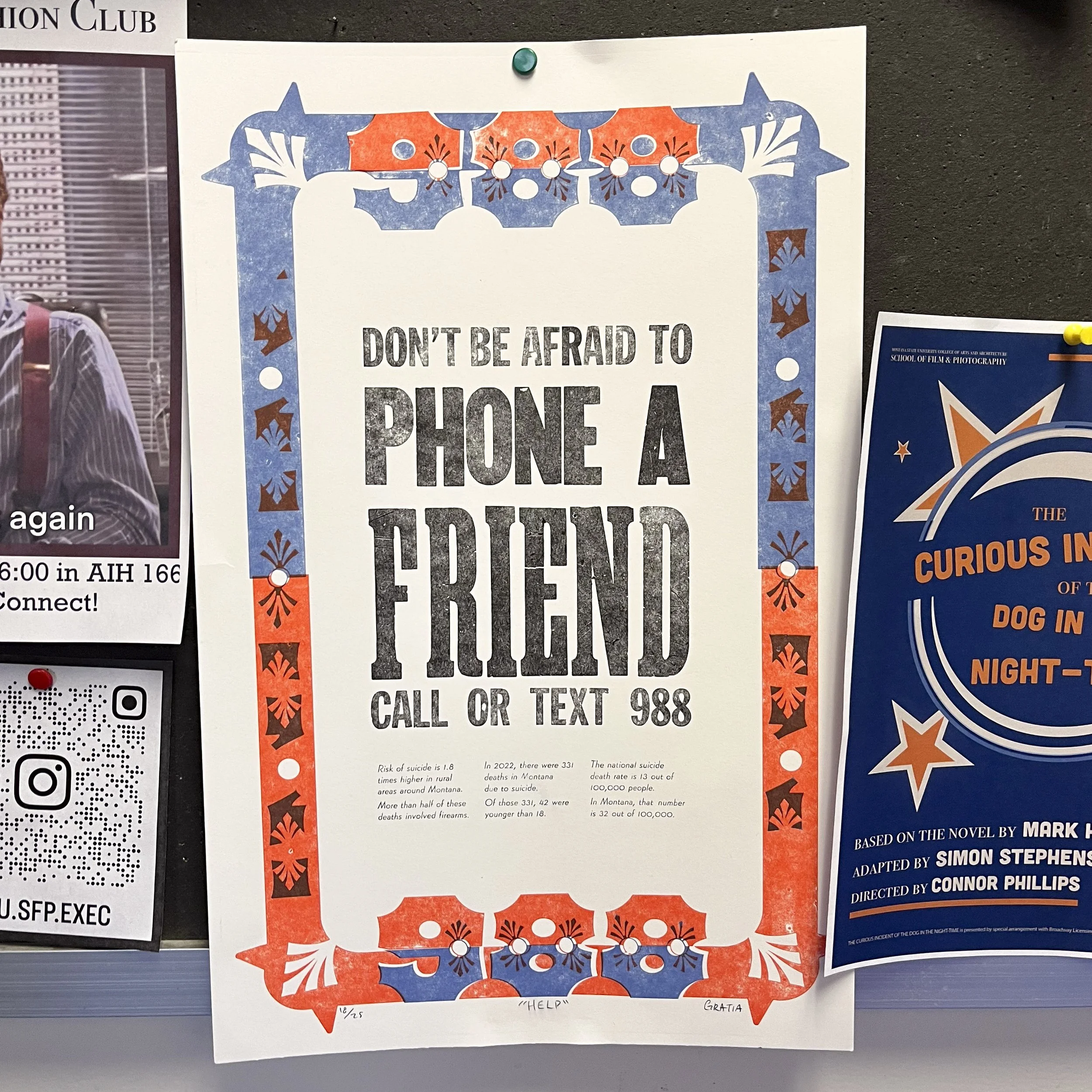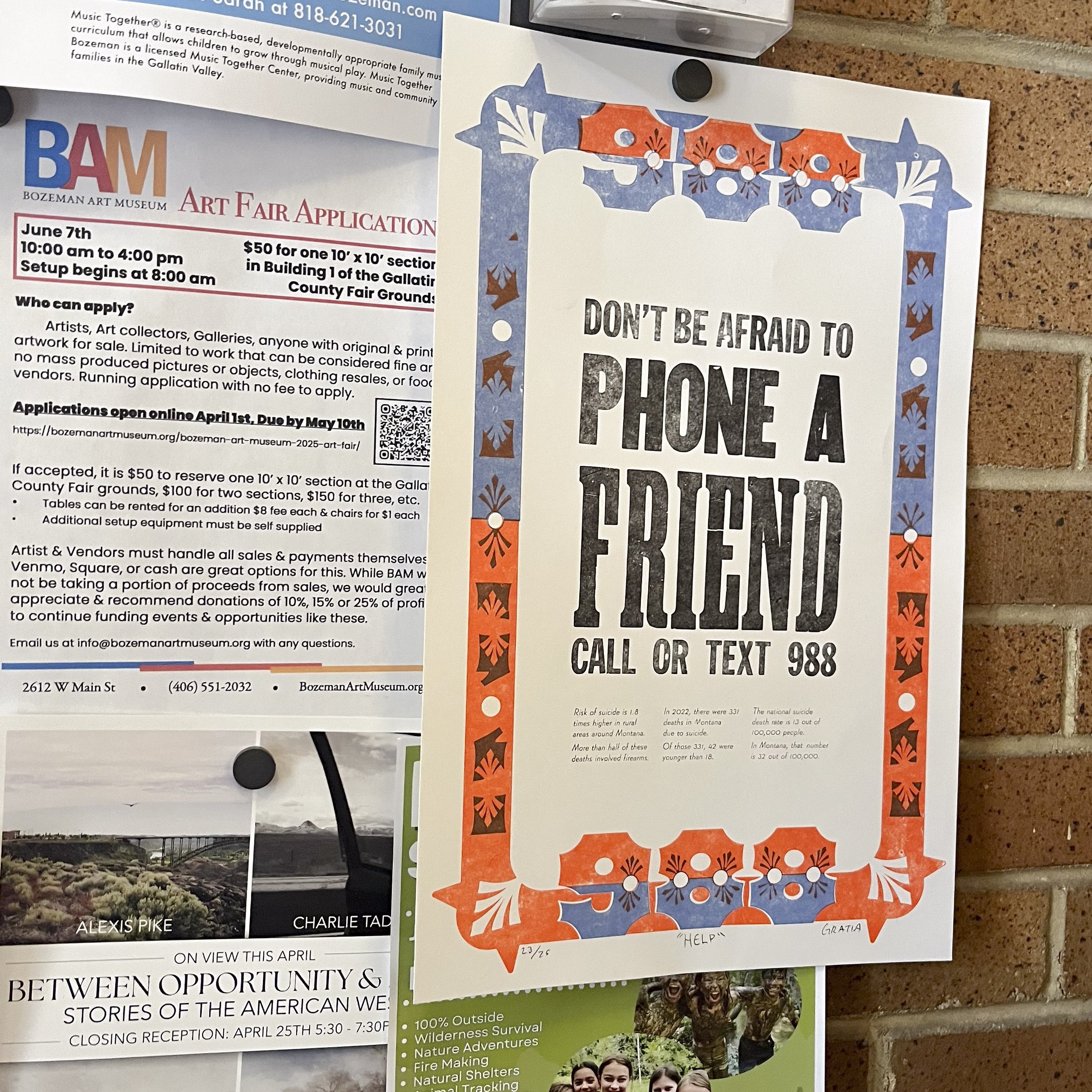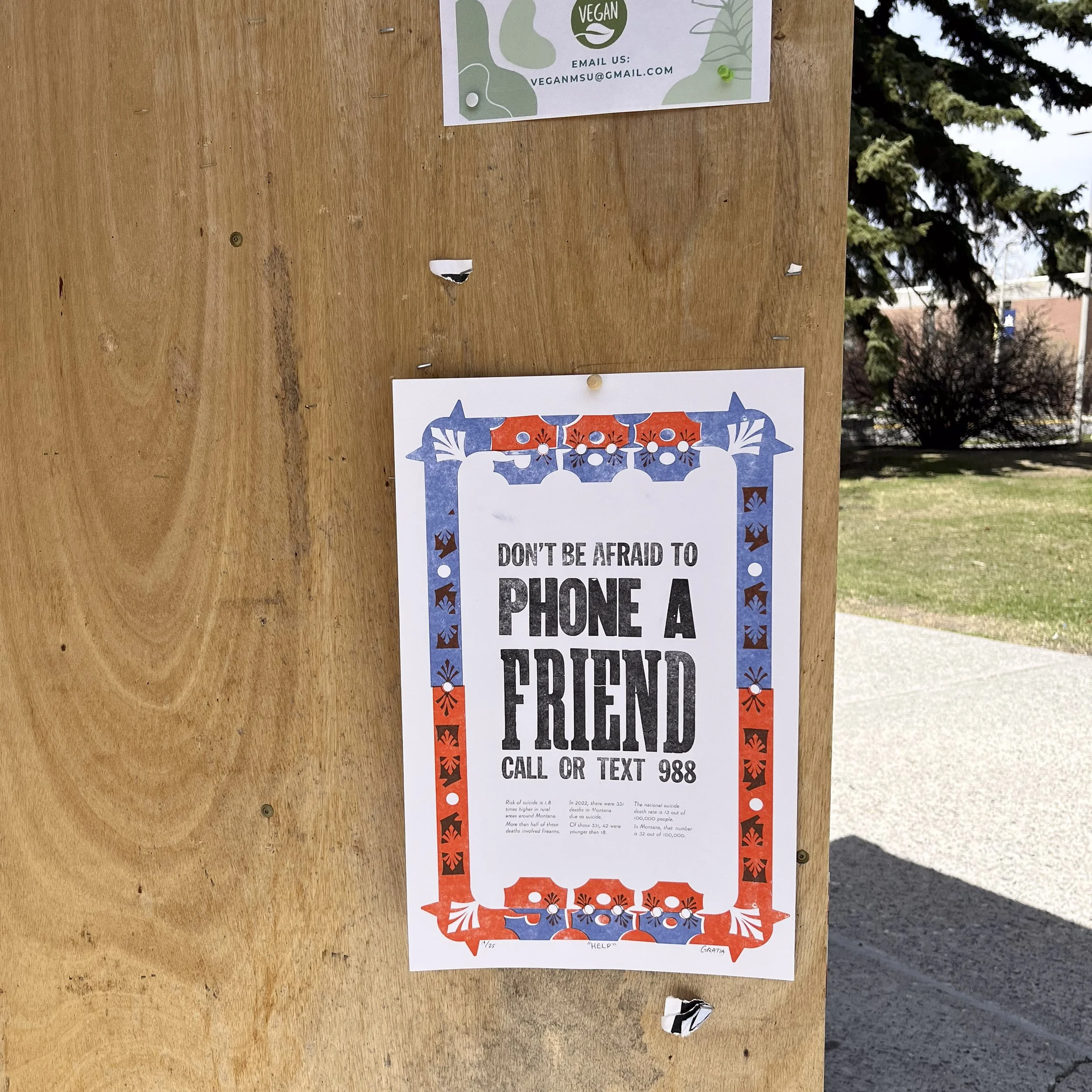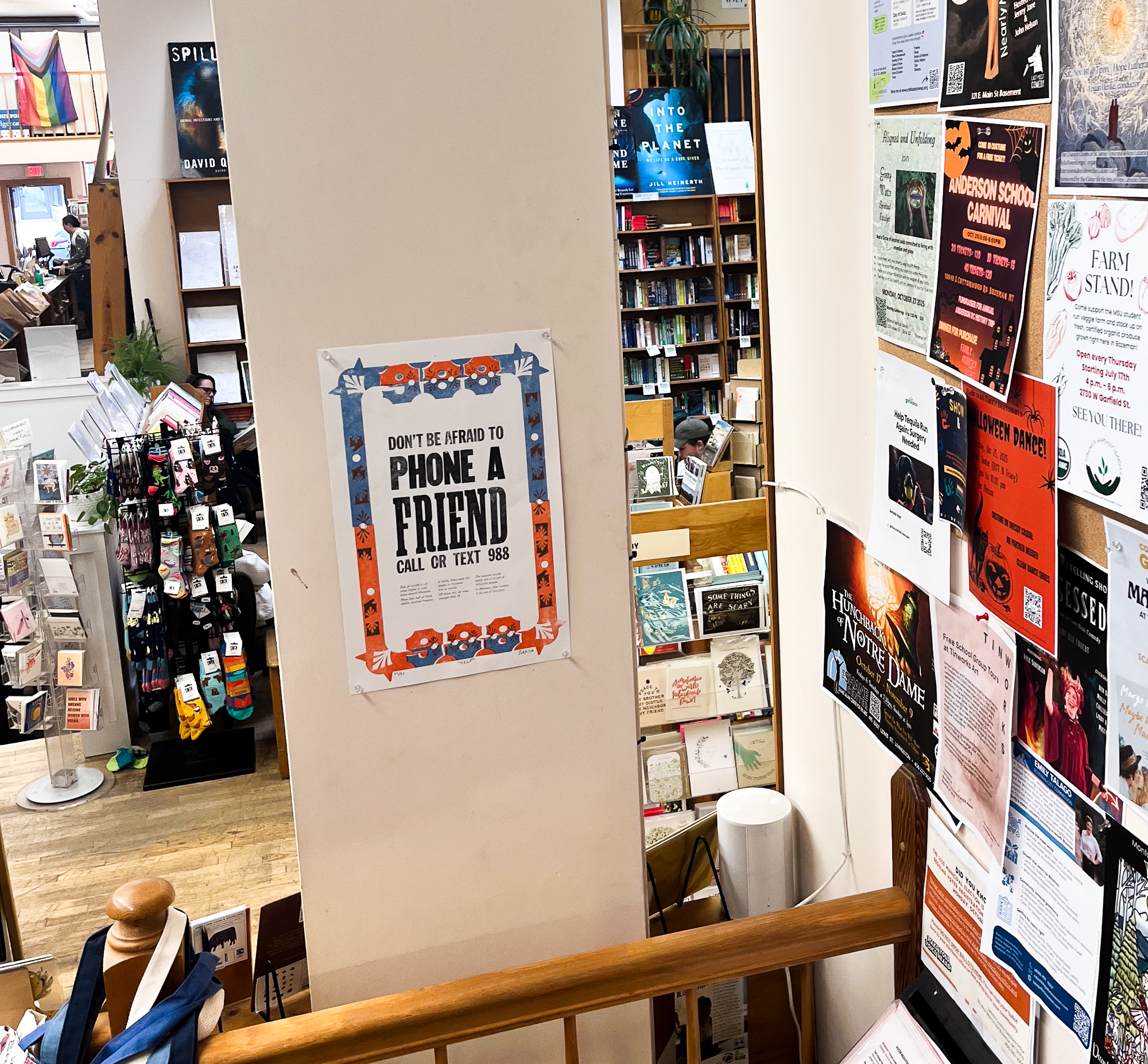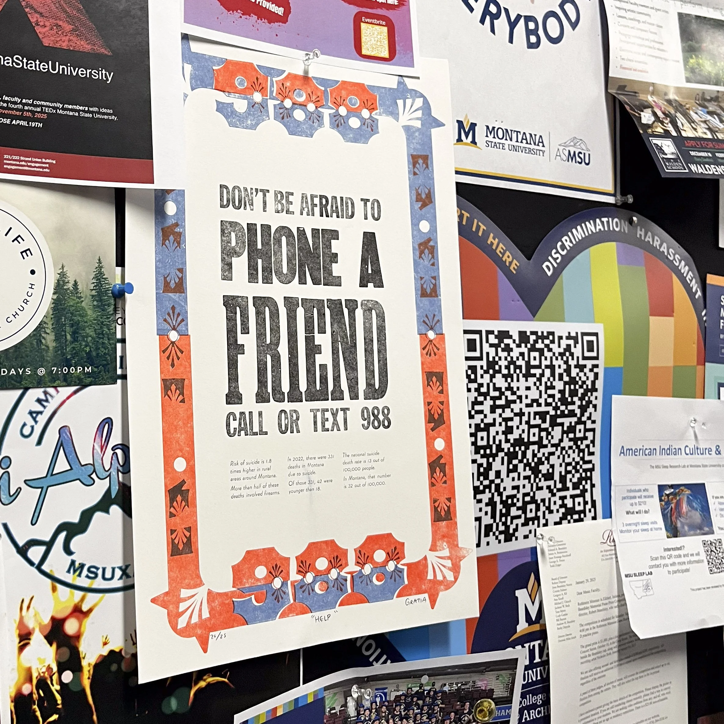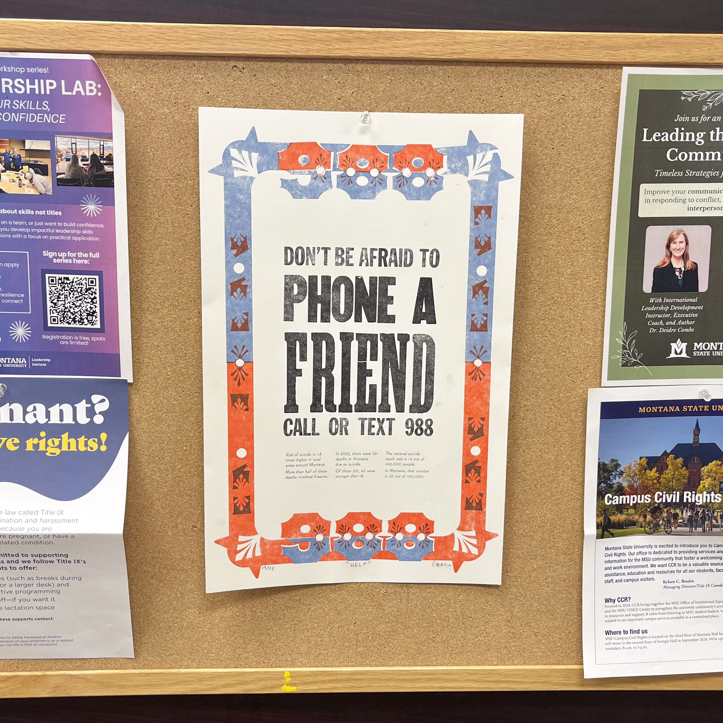
awareness for 988 Letterpress poster
For this project, I needed to choose a social cause I cared for, creating my own eye-catching slogan and presenting important fact relating to suicide rates in Montana. While the 988 hotline is not exclusive to the state, Montana has consistently been apart of the top three states with the highest suicide rate. Personally, I find this lifeline important as I struggled with my own mental health as a teen and I have seen the impact suicide can leave in a community.
While the type of this poster was printed using wood and metal type, the chromatic border was designed by me. It was a requirement that my border was inspired by Gothic Tuscan, a historic wood type style created in North America in the 1850s. The typeface is known for elaborate decorative motifs and though it is a sans serif typeface, it is often mistaken for a serif typeface.
To make the message clear, I included 988 into the border design to emphasize the importance of the number. I included the decorative semicolons as well as it is a symbol that has been adopted by many suicide survivors and used to bring suicide awareness. The design was created in Illustrator and then lasercut into plexiglass, which was then hand-glued onto MDF board and made ready for printing.
Research was a major focus for this project, as I did not just need to find examples of Gothic Tuscan, but present my finding on the typeface to the entire class. Aside from breaking down the type anatomy to find the building blocks I would need in my border design, I had to find examples of chromatic borders to use as inspiration.
I had great luck when it came to typesetting my message, especially when it came to keeping the typeform tight and square. I did have to print twice, however, as the wood type was slightly taller than the 12pt metal type I used for the body paragraphs. Setting the type was always my favorite part about letterpress, and I especially loved working with wood type because of the texture and visible damage the type had endured of the years. A fun fact is that the ‘E’ in friend was carved into the back of an ‘F’ sort.


